Skillramp
Build, sell, and scale your online academy
Overview of the Project
The Platform for Digital Educators
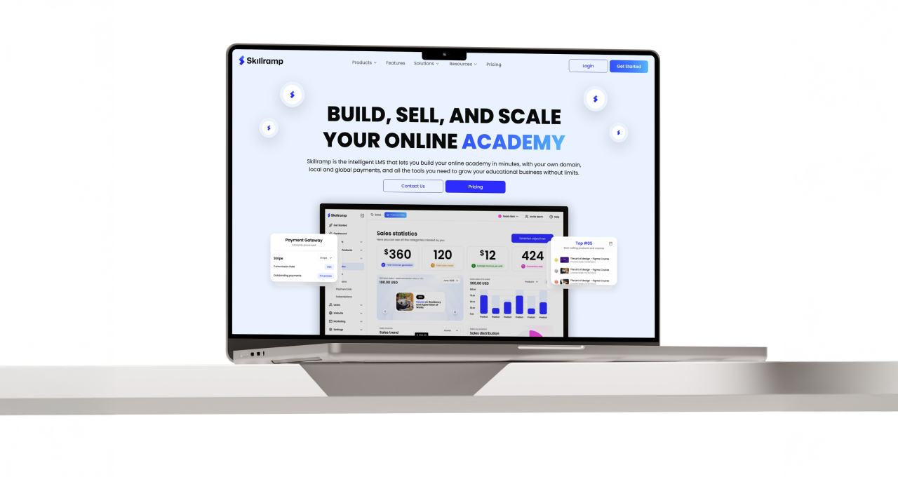
Skillramp is an intelligent LMS built for educators and creators who want to launch an online academy quickly, operate on their own domain, accept payments locally and globally, and run growth oriented learning businesses. The product sits where education meets commerce, so trust and clarity matter from the first interaction. The brand needed to communicate that balance with confidence and restraint.
Skillramp had a strong product premise, but the brand needed to carry the same level of confidence. We created a cohesive identity system that can stretch across product, marketing, and partnerships without losing clarity. The work covered logo refinements, design elements, color and typography, and a flexible visual framework designed for repeated use.
Our Scope
Skillramp partnered with our team for a full rebrand across identity, visual language, and core brand assets.
- Research
- Branding
Sector
Education, Payments, Creator


The Challenge
Breaking Through the Noise
Skillramp sits at the intersection of learning and monetization. That category overlap raises the bar. The brand has to feel credible enough for payments, structured enough for education, and modern enough for creators who move fast.
The category is saturated with interchangeable SaaS branding, making recognition and recall difficult.
The product spans multiple value pillars, but the brand needed one clear point of view.
Trust had to be communicated instantly because payments and customer revenue are part of the promise.

Our Approach
A System for Scaling Ambition
Our solution was a strategic rebrand centered on the idea of an "upward journey". We developed a visual system that is both structured and dynamic, reflecting the platform's ability to support educators at every stage of their growth.
We designed a new logo mark that embodies the name "Skillramp" as a visual metaphor for progress.
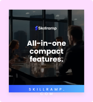
A vibrant and professional color palette was established to balance creative energy with platform credibility.
We created a system of flexible geometric elements to ensure a cohesive and ownable brand expression.
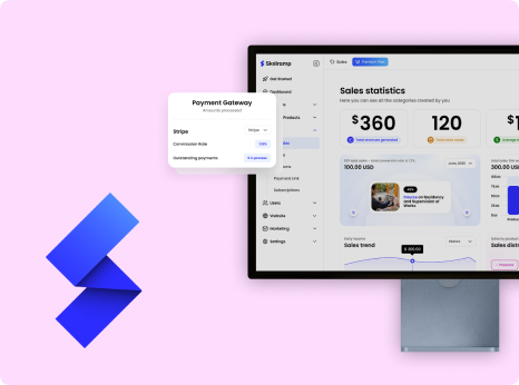
The entire identity was built to be scalable, supporting Skillramp from app icons to enterprise-level marketing.
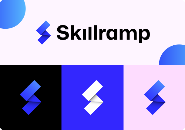
The Symbol
The Mark of Momentum
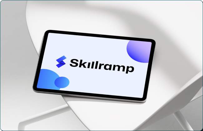
At the center of the new identity is the Skillramp logo mark. It is not just a letter but a story. The folded forms create an 'S' while simultaneously suggesting steps, layers, and an upward ramp. This single, elegant symbol encapsulates the brand's promise of growth, making the abstract concept of scaling one's skills tangible and immediate. It is a mark designed for a digital-first world, recognizable at any size.
The Outcome
Enabling Exponential Growth
The comprehensive rebrand provided Skillramp with a clear and compelling identity that resonates with its target audience. The new visual system immediately establishes the company as a modern and serious contender in the global Ed-Tech market. It provides a strong foundation for all future marketing and product experiences, ensuring a consistent and impactful brand presence. The identity now works as hard as the product itself to build trust and inspire action. The robust branding supports the platform’s claims of advanced features and global scale, justifying premium pricing tiers.

"The new identity perfectly captures our mission to empower educators."
Our brand finally feels as dynamic and forward-thinking as our platform. The team delivered a strategic and beautiful system that will be fundamental to our growth for years to come.
Kris Ludwig
CEO & Co-founder, Skillramp